Exploratory Data Analysis
![]()
This notebook includes some visualisation and exploration of the price and fuel data for Germany and Great Britain
Imports
#exports
import pandas as pd

import matplotlib.pyplot as plt
import matplotlib.transforms as mtf
import seaborn as sns
Loading Data
#exports
def load_EI_df(EI_fp):
    """Loads the electric insights data and returns a DataFrame"""
    df = pd.read_csv(EI_fp)

    df['local_datetime'] = pd.to_datetime(df['local_datetime'], utc=True)
    df = df.set_index('local_datetime')

    return df
%%time

df = load_EI_df('../data/raw/electric_insights.csv')

df.head()
Wall time: 2.29 s
| local_datetime | day_ahead_price | SP | imbalance_price | valueSum | temperature | TCO2_per_h | gCO2_per_kWh | nuclear | biomass | coal | ... | demand | pumped_storage | wind_onshore | wind_offshore | belgian | dutch | french | ireland | northern_ireland | irish |
|---|---|---|---|---|---|---|---|---|---|---|---|---|---|---|---|---|---|---|---|---|---|
| 2009-01-01 00:00:00+00:00 | 58.05 | 1 | 74.74 | 74.74 | -0.6 | 21278 | 555 | 6.973 | 0 | 17.65 | ... | 38.329 | -0.404 | nan | nan | 0 | 0 | 1.977 | 0 | 0 | -0.161 |
| 2009-01-01 00:30:00+00:00 | 56.33 | 2 | 74.89 | 74.89 | -0.6 | 21442 | 558 | 6.968 | 0 | 17.77 | ... | 38.461 | -0.527 | nan | nan | 0 | 0 | 1.977 | 0 | 0 | -0.16 |
| 2009-01-01 01:00:00+00:00 | 52.98 | 3 | 76.41 | 76.41 | -0.6 | 21614 | 569 | 6.97 | 0 | 18.07 | ... | 37.986 | -1.018 | nan | nan | 0 | 0 | 1.977 | 0 | 0 | -0.16 |
| 2009-01-01 01:30:00+00:00 | 50.39 | 4 | 37.73 | 37.73 | -0.6 | 21320 | 578 | 6.969 | 0 | 18.022 | ... | 36.864 | -1.269 | nan | nan | 0 | 0 | 1.746 | 0 | 0 | -0.16 |
| 2009-01-01 02:00:00+00:00 | 48.7 | 5 | 59 | 59 | -0.6 | 21160 | 585 | 6.96 | 0 | 17.998 | ... | 36.18 | -1.566 | nan | nan | 0 | 0 | 1.73 | 0 | 0 | -0.16 |
We'll do the same for the German Energy-Charts and ENTSOE data
#exports
def load_DE_df(EC_fp, ENTSOE_fp):
    """Loads the energy-charts and ENTSOE data and returns a DataFrame"""
    # Energy-Charts
    df_DE = pd.read_csv(EC_fp)

    df_DE['local_datetime'] = pd.to_datetime(df_DE['local_datetime'], utc=True)
    df_DE = df_DE.set_index('local_datetime')

    # ENTSOE
    df_ENTSOE = pd.read_csv(ENTSOE_fp)

    df_ENTSOE['local_datetime'] = pd.to_datetime(df_ENTSOE['local_datetime'], utc=True)
    df_ENTSOE = df_ENTSOE.set_index('local_datetime')

    # Combining data
    df_DE['demand'] = df_DE.sum(axis=1)

    s_price = df_ENTSOE['DE_price']
    df_DE['price'] = s_price[~s_price.index.duplicated(keep='first')]

    return df_DE
df_DE = load_DE_df('../data/raw/energy_charts.csv', '../data/raw/ENTSOE_DE_price.csv')

df_DE.head()
| local_datetime | Biomass | Brown Coal | Gas | Hard Coal | Hydro Power | Oil | Others | Pumped Storage | Seasonal Storage | Solar | Uranium | Wind | Net Balance | demand | price |
|---|---|---|---|---|---|---|---|---|---|---|---|---|---|---|---|
| 2010-01-03 23:00:00+00:00 | 3.637 | 16.533 | 4.726 | 10.078 | 2.331 | 0 | 0 | 0.052 | 0.068 | 0 | 16.826 | 0.635 | -1.229 | 53.657 | nan |
| 2010-01-04 00:00:00+00:00 | 3.637 | 16.544 | 4.856 | 8.816 | 2.293 | 0 | 0 | 0.038 | 0.003 | 0 | 16.841 | 0.528 | -1.593 | 51.963 | nan |
| 2010-01-04 01:00:00+00:00 | 3.637 | 16.368 | 5.275 | 7.954 | 2.299 | 0 | 0 | 0.032 | 0 | 0 | 16.846 | 0.616 | -1.378 | 51.649 | nan |
| 2010-01-04 02:00:00+00:00 | 3.637 | 15.837 | 5.354 | 7.681 | 2.299 | 0 | 0 | 0.027 | 0 | 0 | 16.699 | 0.63 | -1.624 | 50.54 | nan |
| 2010-01-04 03:00:00+00:00 | 3.637 | 15.452 | 5.918 | 7.498 | 2.301 | 0.003 | 0 | 0.02 | 0 | 0 | 16.635 | 0.713 | -0.731 | 51.446 | nan |
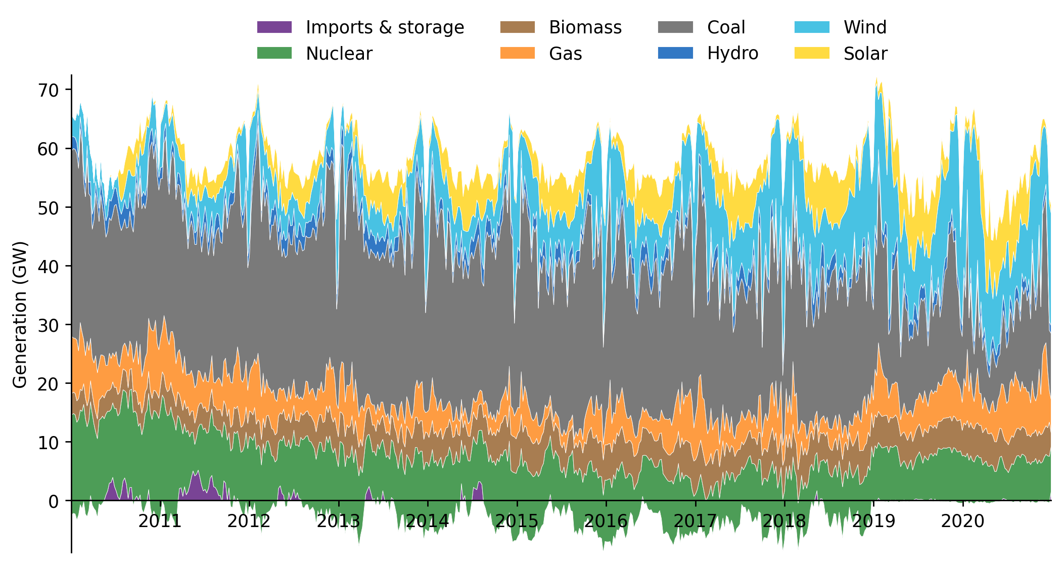
Stacked-Fuels Time-Series
We'll create a stacked plot of the different generation types over time. We'll begin by cleaning the dataframe and merging columns so that it's ready for plotting, we'll also take the 7-day rolling average to make long-term trends clearer.
#exports
def clean_EI_df_for_plot(df, freq='7D'):
    """Cleans the electric insights dataframe for plotting"""
    fuel_order = ['Imports & Storage', 'nuclear', 'biomass', 'gas', 'coal', 'hydro', 'wind', 'solar']
    interconnectors = ['french', 'irish', 'dutch', 'belgian', 'ireland', 'northern_ireland']

    df = (df
          .copy()
          .assign(imports_storage=df[interconnectors+['pumped_storage']].sum(axis=1))
          .rename(columns={'imports_storage':'Imports & Storage'})
          .drop(columns=interconnectors+['demand', 'pumped_storage'])
          [fuel_order]
         )

    df_resampled = df.astype('float').resample(freq).mean()
    return df_resampled
df_plot = clean_EI_df_for_plot(df)

df_plot.head()
| local_datetime | Imports & Storage | nuclear | biomass | gas | coal | hydro | wind | solar |
|---|---|---|---|---|---|---|---|---|
| 2009-01-01 00:00:00+00:00 | -0.039018 | 5.76854 | 0 | 16.2951 | 20.1324 | 0.35589 | 0.390015 | 0 |
| 2009-01-08 00:00:00+00:00 | -0.921768 | 5.5829 | 0 | 16.3811 | 21.6997 | 0.551753 | 1.15155 | 0 |
| 2009-01-15 00:00:00+00:00 | -0.024241 | 5.55999 | 0 | 14.84 | 20.4463 | 0.704382 | 1.483 | 0 |
| 2009-01-22 00:00:00+00:00 | 0.18283 | 6.22841 | 0 | 14.4678 | 20.5907 | 0.562277 | 0.938827 | 0 |
| 2009-01-29 00:00:00+00:00 | 0.120204 | 6.79959 | 0 | 13.9657 | 21.3497 | 0.519632 | 1.36261 | 0 |
We'll also define the colours we'll use for each fuel-type
N.b. the colour palette used is from this paper
fuel_colour_dict_rgb = {
    'Imports & Storage' : (121,68,149),
    'nuclear' : (77,157,87),
    'biomass' : (168,125,81),
    'gas' : (254,156,66),
    'coal' : (122,122,122),
    'hydro' : (50,120,196),
    'wind' : (72,194,227),
    'solar' : (255,219,65),
}
However we need to convert from rgb to matplotlib plotting colours (0-1 not 0-255)
#exports
def rgb_2_plt_tuple(r, g, b):
    """converts a standard rgb set from a 0-255 range to 0-1"""
    plt_tuple = tuple([x/255 for x in (r, g, b)])
    return plt_tuple

def convert_fuel_colour_dict_to_plt_tuple(fuel_colour_dict_rgb):
    """Converts a dictionary of fuel colours to matplotlib colour values"""
    fuel_colour_dict_plt = fuel_colour_dict_rgb.copy()

    fuel_colour_dict_plt = {
        fuel: rgb_2_plt_tuple(*rgb_tuple)
        for fuel, rgb_tuple
        in fuel_colour_dict_plt.items()
    }

    return fuel_colour_dict_plt
fuel_colour_dict = convert_fuel_colour_dict_to_plt_tuple(fuel_colour_dict_rgb)

sns.palplot(fuel_colour_dict.values())

Finally we can plot the stacked fuel plot itself
#exports
def hide_spines(ax, positions=["top", "right"]):
    """
    Pass a matplotlib axis and list of positions with spines to be removed

    Parameters:
        ax:          Matplotlib axis object
        positions:   Python list e.g. ['top', 'bottom']
    """
    assert isinstance(positions, list), "Position must be passed as a list "

    for position in positions:
        ax.spines[position].set_visible(False)

def stacked_fuel_plot(
    df,
    ax=None,
    save_path=None,
    dpi=150,
    fuel_colour_dict = {
    'Imports & Storage' : rgb_2_plt_tuple(121,68,149),
    'nuclear' : rgb_2_plt_tuple(77,157,87),
    'biomass' : rgb_2_plt_tuple(168,125,81),
    'gas' : rgb_2_plt_tuple(254,156,66),
    'coal' : rgb_2_plt_tuple(122,122,122),
    'hydro' : rgb_2_plt_tuple(50,120,196),
    'wind' : rgb_2_plt_tuple(72,194,227),
    'solar' : rgb_2_plt_tuple(255,219,65),
}
):
    """Plots the electric insights fuel data as a stacked area graph"""
    df = df[fuel_colour_dict.keys()]

    if ax == None:
        fig = plt.figure(figsize=(10, 5), dpi=dpi)
        ax = plt.subplot()

    ax.stackplot(df.index.values, df.values.T, labels=df.columns.str.capitalize(), linewidth=0.25, edgecolor='white', colors=list(fuel_colour_dict.values()))

    plt.rcParams['axes.ymargin'] = 0
    ax.spines['bottom'].set_position('zero')
    hide_spines(ax)

    ax.set_xlim(df.index.min(), df.index.max())
    ax.legend(ncol=4, bbox_to_anchor=(0.85, 1.15), frameon=False)
    ax.set_ylabel('Generation (GW)')

    if save_path:
        fig.savefig(save_path)

    return ax
stacked_fuel_plot(df_plot, dpi=250)
<AxesSubplot:ylabel='Generation (GW)'>
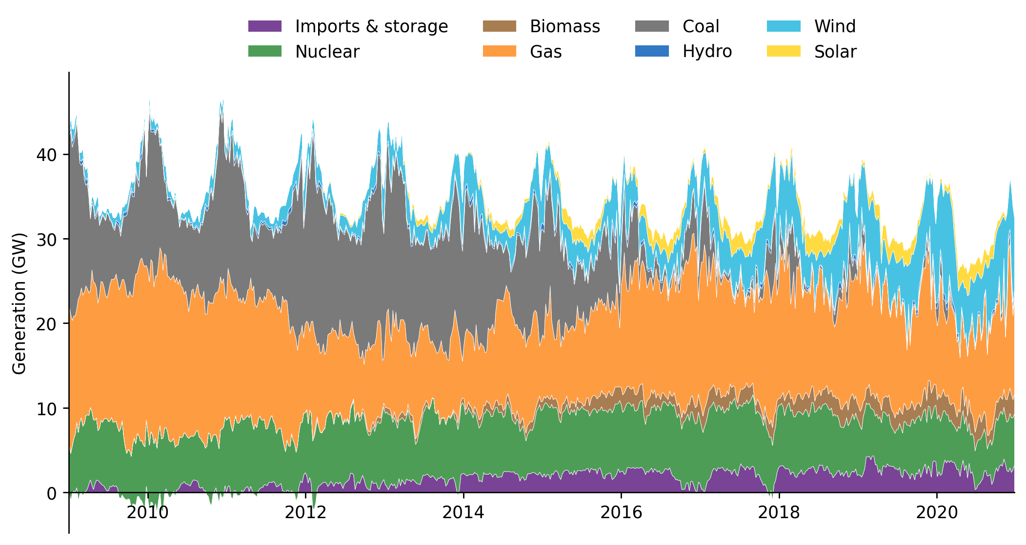
#exports
def clean_EC_df_for_plot(
    df_EC,
    freq='7D',
    fuel_order=['Imports & Storage', 'nuclear', 'biomass',
                'gas', 'coal', 'hydro', 'wind', 'solar']
):
    """Cleans the electric insights dataframe for plotting"""

    df_EC_clean = (pd
                   .DataFrame(index=df_EC.index)
                   .assign(nuclear=df_EC['Uranium'])
                   .assign(biomass=df_EC['Biomass'])
                   .assign(gas=df_EC['Gas'])
                   .assign(coal=df_EC['Brown Coal']+df_EC['Hard Coal'])
                   .assign(hydro=df_EC['Hydro Power'])
                   .assign(wind=df_EC['Wind'])
                   .assign(solar=df_EC['Solar'])
                  )

    df_EC_clean['Imports & Storage'] = df_EC['Pumped Storage'] + df_EC['Seasonal Storage'] + df_EC['Net Balance']
    df_EC_clean = df_EC_clean[fuel_order].interpolate()

    df_EC_resampled = df_EC_clean.astype('float').resample(freq).mean()

    return df_EC_resampled
df_DE_plot = clean_EC_df_for_plot(df_DE)
stacked_fuel_plot(df_DE_plot, dpi=250)
<AxesSubplot:ylabel='Generation (GW)'>